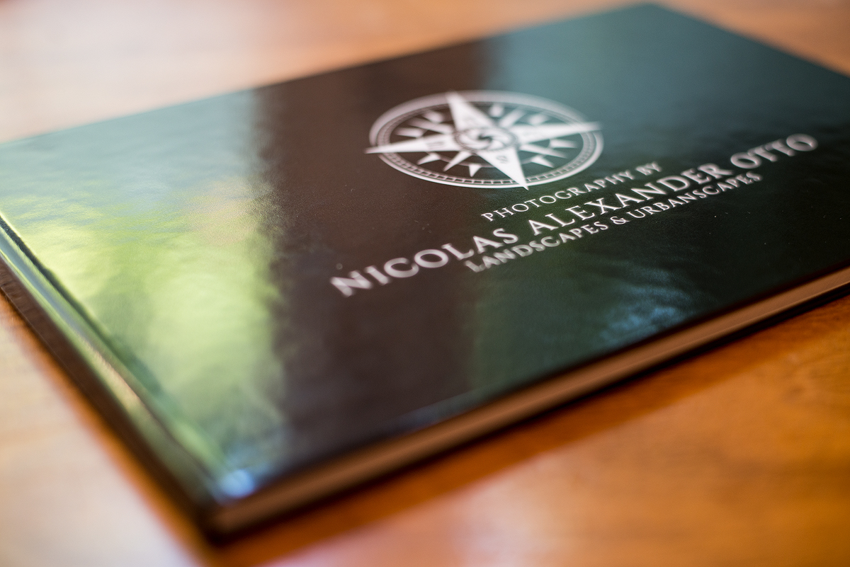
For some time now I have been wanting to get a physical sample book of my landscape photography for promotion purposes, because it is important that clients get a physical impression of what the imagery looks like when printed. So I finally got around to actually getting this point checked of my list.
A friend did a photo book recently with the company Saal Digital and was quite content, selecting some of his favorite images from a African Safari and showing it to me. I went onto their website and noticed that they had a offer for a 40€ coupon so I went at it to create a 30page, 28x19cm horizontal portfolio, with black binding, and standard luster paper.
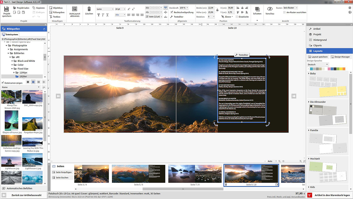
First off, I need to address the layout program. To me it felt very intuitive and self explanatory. Most of the functions are drag and drop, or much akin to design of microsoft office or adobe products. Hence I was able to find my way round the gui within only a few minutes. There were only some minor things that bugged me: I use signature fonts and wanted to design the text in the same typography, but the program apparently does not access windows’ font database instead comes with its own, which does not contain the fonts I needed. There is a broad variety of fonts in it, so you may find something that suits your taste however. The other issue is – but this is a professional remark – there is no option for downsize or upsize algorithms or sharpening after the image is imported and fitted onto the page. Usually when resizing and image I check the quality again and sharpen it according to the new size. In this case I had to do this manually in Photoshop beforehand. I did this only for some images, to be able to compare the re-sharpened to the non-sharpened images in printed form. Alas, there is a minor difference between them, if any at all. But more on that later.
Uploading the imagery was fast, and the process of order and delivery swift and without any issues. A very positive note is the inclusion of a option to pay via pay pal. This is very much appreciated.
After investing some time into a pretty basic design because I was shot on time, it took me about 3 hours to compile my book and send it off. The program also offers many templates which are of varying quality and usability. Still I do prefer my own. Only about 3 days later I had the printed book in my post box. Getting your photography printed is always a good idea and feels very rewarding, so I was very happy that I got it in such a short amount of time.
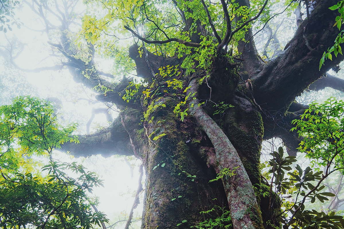
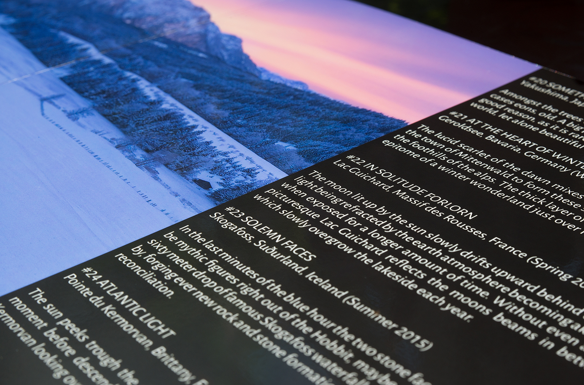
So what’s the quality of the product that I got? First off, it is satisfactory. Not perfect, but considering the price it is of good to very good quality. As mentioned before the quality of the resize algorithm is ok-ish. The shots are not overly blurry by any means, but the micro contrast is considerably lower than in my re-sharpened files. Interestingly this is not the case with all of the files, but mostly the panoramic shots due to their even higher base resolution which has to be rendered down. That said, I have a very keen eye for these type of things, having been printing files with various companies for years now, professionally and privately. For everyone who does not want to invest a huge amount of time into sharpening and resizing their images for a specific format it does the job though. Most likely non-professionals will not notice anything of that sort. Below you can see a 100% view of the photo book and the original file in comparison. There is barely any aberration to be found, neither in contrast, micro contrast, nor in color in this case.
The color management is very much on par as well. I used the regular luster paper and have to admit the hues are spot on for the most part. Only the yellow and oranges seem to have suffered a bit in the highlights. They lack a bit of the vibrancy of the original files, rendering some of my sunset shots a little more bland than I’d like them to look. Interestingly enough the blues are exactly as they should because to my experience prints usually give way to over saturated and darkened blues. With Saal-Digital this doesn’t seem to be an issue however. Ultimately I am very content with the outcome of the colors. Also I have to note that I like the fact they only use sRGB (who uses CMYK anymore anyway?), so no conversion is messing up the colors.
Here you can see, that the blues got a little darker with some slight cyan and the orange light pollution has a little less yellow, but only minimal, barely enough to notice if not in direct comparison. The blue hues of my other shots were almost perfect.
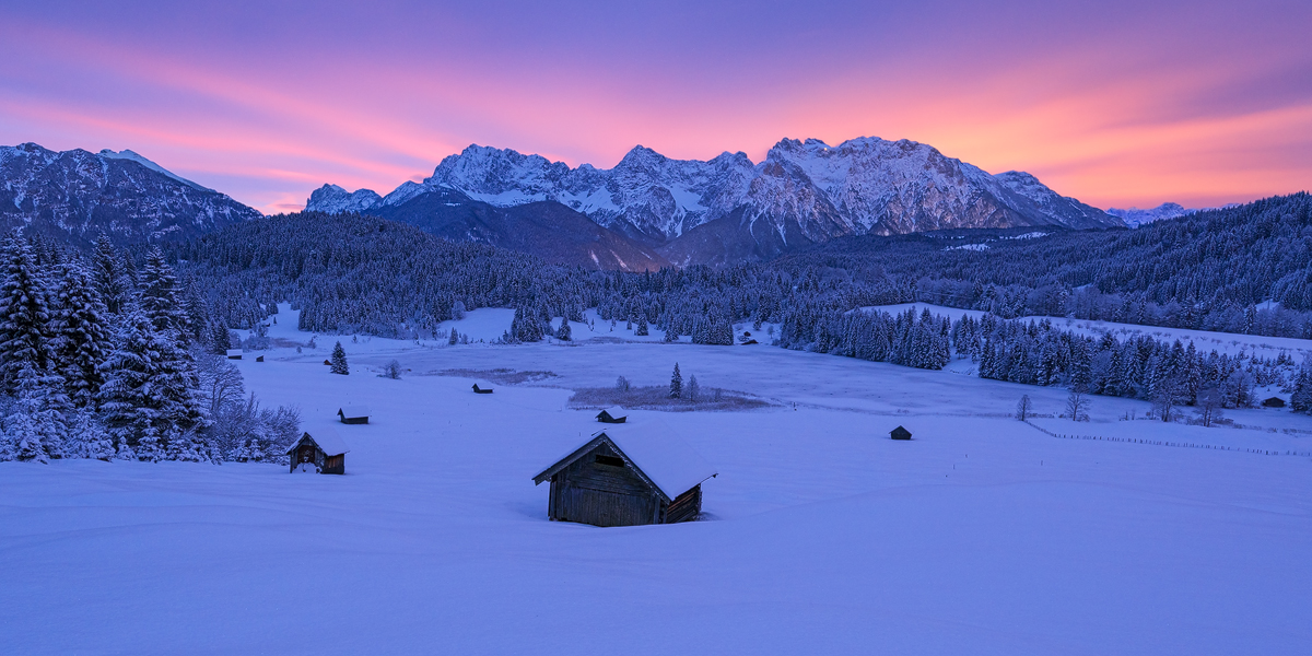
The brightness and contrast were also as desired. I lightened the shots in the design program prior to the print – not in Photoshop mind you – by +5 brightness and left the contrast as is, to get the results I wanted.
All in all the book is satisfactory and I would recommend trying Saal Digital for such a physical portfolio at a budget. They offer a lot of different formats, papers, types of binding and much more. If you looking for a company to send your holiday shots to for a photo book to show to your friends and family and don’t want to learn a complex program, but instead are looking an user-friendly interface and quick delivery this is the address for. I will certainly try to find the time for a black and white portfolio as well.